Monday, November 17, 2008

Planters: why are they so hard to find?

I have an affinity for house plants. Luckily, it's not antithetical to the whole mid-century modern ideal (I have a massive collection of great, mid-century Sunset "how to" books on plants, planters, potting, containers, etc., to prove it!). However, it has been infuriating trying to find period containers for my little friends.

I scored a couple good, giant vessels in the style of Architectural Pottery (http://www.architecturalpottery.com/) at a thrift store for $30 a piece (that was a major find), but for the most part, I've had a heck of a time finding anything. Even online I've had trouble, so I decided to put together a little list that I'll try and update as I find more sources.

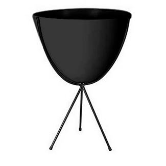
The most obvious prospect is the bullet planter. These used to be a fun little icon of the 50's, but now they cost upward of $165 (just for the medium size). Freaking ridiculous. I'm not even going to put links, 'cause that's just an insane amount of money to pay for something to stick a plant in.

You can usually find some decent Haeger on E-bay for not too much cash, but if they're of any sort of substantial size, shipping is a killer. The same problem (shipping) exists with any pottery you find online.

Why can't I find just a simple cylinder shape with no taper?

Chiasso makes this one, but it looks too thin to be ceramic or terra cotta, so it's probably plastic or aluminum (why wouldn't it say what it's made of in the description?), not to mention it's $68 plus shipping for a 14"x14" size (what they call large). Lame.

I just want to walk into Lowe's or Home Depot and pick up a very simple plant receptacle. White or cream, no little squigglies or faux finish, no stupid shapes. Just a plain cylinder for my plants.

Is that too much to ask?

Gainey makes some cool stuff, but again, it is cost prohibitive.

David Cressey made some really cool stuff too, but it's a little too "decorative" for my taste. Plus, since it's highly collectible, good luck finding an affordable piece.

I'm probably going to end up building my own planters from poured concrete. They'll be heavy, but they'll be simple!
...

Thursday, September 18, 2008

Hardoy Butterfly Chair Covers

We inherited two original, steel-frame Hardoy Butterfly chairs from my great aunt and uncle. Unfortunately, they came without covers, so all we have are the frames. I began my search for new covers the other day. You wouldn't think it would be so damn hard to find a simple (decent) cover for a Hardoy Butterfly chair.

I like the design of this chair, as they look pretty cool just as frames, sculptural and what not. So when you take the cover inside to prevent damage during inclement weather, what's left isn't an eyesore but still interesting.

The chair's design came from architects in Le Corbusier's office in 1938 (Antonio Bonet, Jorge Ferrari-Hardoy and Juan Kurchan). Now that they are sold by Target and Pottery Barn, they are a little less cool, but those models are generally foldable, so it's easy to tell an original from the new, flimsier knock-offs.

I'd love to have the original style, saddle-leather covers, but it would seem that route is cost prohibitive at around $1,500 for the only leather cover I could find. And those look pretty bad; nothing like the original.

So I’ll continue my search for good covers for Hardoy chairs.  If you’ve got a source, please post in the comments!

LA: John Lautner House Tours

Would that I were wealthy and lived in LA. It seems that along with the Lautner exhibit at the Hammer Museum (Between Heaven and Earth: The Architecture of John Lautner -through October 12), the Hammer Museum is also conducting house tours of Lautner properties. http://www.hammer.ucla.edu/programs/65/

If you are able, I highly recommend you take advantage of this opportunity! If not, at least go see the exhibit at The Hammer Museum.

Tour I: Sunday, July 27, 2008
Tickets: $145 each


The Harpel Residence (1956)
The Tyler Residence (1953)
The Schwimmer Residence (1982)

Tour II: Sunday, September 14, 2008
Tickets: $145 each


The Jacobsen Residence (1947)
The Harvey Residence (1950)
The Reiner/Burchill Residence - also known as Silvertop (1963)

Tour III: Sunday, August 24, 2008
Tickets: $55 each


Sheats/Goldstein Residence (1963)

Tour IV: Sunday, October 12, 2008
Tickets: $55 each


Sheats/Goldstein Residence (1963)

Ticket prices are listed above and include admission to the exhibition, shuttle service, free parking (Tours I & II), discounted parking (Tours III & IV), and for Tour I and Tour II ticket buyers only--an active level friendship to the MAK Center at the Schindler House.

To purchase tickets for Tours I and II, you must be a member of the Hammer Museum at the Contributor level or above. Up to four (4) tickets can be purchased per membership. For more information on Hammer membership, click here. To purchase tickets for Tours III and IV, no membership is required.

Tuesday, September 9, 2008

Hans Olsen table


Craigslist RULES! I'd say the vast majority of the furniture we own that falls into the "super-cool" category (Saarinen coffee table, Danish bar with Eric Buck stools... and now the Hans Olsen table and chairs!) has come from Craigslist.

Our latest purchase is this fantastic dining table by Hans Olsen. The chairs are three legged and fit neatly underneath the table... the chair backs becoming one with the bottom border of the table.

For an added level of fun kitsch, the table came with a vinyl/board cover in its original box that even included a receipt from 1963!

Saturday, September 6, 2008

Shedding a little light on the George Nelson Bubble Lamp

One of the things that we are so excited about concerning our 1955 home, is that nothing has been changed since it was built. Nothing that is, except for the lights in the great room.

This guy isn't exactly 1955:

Now this guy, however...

That's what I'm talking about!

While we are making a concerted effort to start seeking out "lesser knowns" for our decor, the Nelson Bubble lamp is one staple that just seems too perfect to ignore. It will go so nicely above the Hans Olsen round table in the dining nook. I was thinking I'd make a light, or perhaps assemble something from various mid-century vintage parts... but that saucer just keeps calling (not to mention we just buy it and hang it up, and that's much more likely to happen quickly).

Now the only problem is deciding if we should get the 25" or the 36" (the 48" just seems a little ridiculous for our space). The Olsen table is 42" in diameter. I held up a 25" box and it seemed plenty big, but I think the tapered edges of the saucer might make the 25" lamp appear much smaller. I'm just a little worried to get the bigger one and have it look top heavy... though I do think the cylinder that will be formed by the light and the table below could be pleasing.

Yes, $300 (for the 25" --$365 for the 36") does seem a little steep for a ceiling light, but I think it's a cost we'll be able to deal with. If we buy from DWR, we get taxed because they have stores in Colorado. If we purchase from the manufacturer (Modernica in Chicago) however, there is no tax and free shipping.

It is no help though to see that the original 25" saucer shaped Bubble Lamp (H-763) retailed for $35 when it was first made available in 1947. What's the math? Is that appropriate inflation? What do you know... using this handy little inflation calculator, I found that $35 in 1947 would be $321.68 in 2007 (the latest year the calculator would calculate). So $300 from Modernica is actually $21.68 cheaper than what it cost when it first came out. Sweet! We're getting a bargain!

Something I was surprised to find out was that Howard Miller made accessories available for the lamps, including a satin-chrome or brass-finished steel tripod base, swing arms and adjustable pulleys. After finding this out, I may dismantle one of the eleven vintage lamps hanging in the workshop and add the spring loaded pulley to our Bubble Lamp.

There's some more interesting information available at this link: http://www.georgenelson.org/bubblelamps.html

Saturday, August 2, 2008

Bucky or Lautner, either's a good show

Whether you're on the East or the West Coast, you've got fantastic options for heading out to a great architecture exhibition right now. With Buckminster Fuller: Starting With the Universe (through Sept. 21) at the Whitney in NYC and Between Earth and Heaven: The Architecture of John Lautner (through October 12) at the Hammer Museum in LA, either one gets you an awesome exhibition of great mid-century architecture (and beyond).

If you're in NYC, you get to see the only existing Dymaxion!
If you're in LA, you get to see some of the greatest houses known to man.
Another exhibition worth mentioning, just a little further up the coast on the left is A Beautiful Nothing: The Architecture of Edward A. Killingsworth (through October 12) at Santa Barbara's University Art Museum. Man I love me some Killingsworth.

Thursday, April 17, 2008

We Commited a Carnal Sin (an "experiment" with knock-offs)

Shhh... don't tell anyone.

We bought a knock-off. Two, actually.

Now before you start sending me flaming hate mail, let me put forth my... erm, excuses.

We've been looking for a Saarinen Tulip table and chairs for the kitchen nook as long as we've lived in our sweet-ass, 1955 Colorado Ranch. A lot of our stuff we kind of get a general idea or feeling for, and then when we find a piece that fits the requirements, we snag it.

However, with the kitchen nook, we knew we wanted two Tulip Chairs and a 30" Tulip dining table (which it turns out they don't make), no questions. We would've settled for vintage Burke as well, but not the x-base. The "trumpet" pedestal was specifically what we were after.

We've been to the Knoll dealers, DWR and I've been culling E-bay and Craigslist for months. At one point, we almost "went for it" and bid on a huge, oval dining table and 12 chairs for the dining room instead of the nook. It actually would've been a great deal, but sanity kicked in and we held on to our $5,500 right before the auction ended (it really was a super-fantastic deal for an original Knoll set of that magnitude). A "re-sizable" table will be much better for our dining space though.

Anyway, over the search period, we scored an original Saarinen Tulip coffee table (Craigslist, $150: nicks on edges, mild scratches to the surface) and an original Tulip Table base that somebody desecrated with a can of spray paint (I'll be taking it to an auto finishing garage for a proper new coat of love).

However, it seemed impossible to find a good deal on two chairs. We actually found quite a few original captain's chairs (with the arms), but our nook area won't accommodate the extra size, not to mention I'm not a fan of how the arm chairs and swivel bases work with a table... too much arm/back curve to table edge bashing.

Now let me point something out: at DWR, a Saarinen Tulip side chair costs at least $1200.

For a freaking dining chair.

Your standard kitchen chair at Target or Ikea will run you around $40 to $150. I'm not saying a Saarinen Tulip chair is comparable to a Chinese-made, piece of bent steel with a poly-vinyl seat, but since this blog is called "Real Mod" and tries to address the issue of modern for people in a "realistic" (I'm not rich) situation, I am pointing out what "normal" people pay for a place to plant their backsides while eating.

Yes a high price tag insures all kinds of things... consistency going back 50 years, precision, quality, etc... but surely these things can be delivered for a more down to earth price.

During my E-bay searches, I'd been seeing the $150 Tulip knock-offs. Understand, I realize the problems with knock-offs: little to no quality control in the product, polluting the pool, imperfections, slight differences in lines and function, even the issue of sub-par items that will cause modern newbies to think the real-deal are not of good quality (because those people wouldn't know the difference between real and fake and thus think the real product was not good product, one of the very problems that this blog seeks to combat).

But two chairs for $374.98 delivered vs. nearly $3k? Argh. The dilemma.

Ultimately I didn't listen to Jimminy Cricket, and I went for it. I clicked buy and sent payment via PayPal.

After some problems with our Fed Ex guy (don't get me started), we finally received our chairs.

They were packaged unbelievably well, and it was like Xmas tearing apart the crate and removing the chairs. The seats were not attached to the base, so there was some assembly required, basically a rod that threaded into the seat and then ran through the base and affixed at the bottom by a bolt. There was a ball-bearing ring recessed in the top of the base that facilitated smooth rotation and everything seemed great.

They look fantastic. Great paint job, good looking cushion (more on that later), the shape and curves of the seat are right, and they feel just like the real thing when you're sitting in them. The only visual difference is that the base (the flared, trumpet part) has a bit of a falling cascade to the edge instead of really tapering out to almost flat like the actual Knoll (and even Burke) bases do (see comparison below). But for our purposes, I could forgive this slight design imperfection, and the average person was not going to be able to tell the difference.


correct base edge
(this is a knock-off; note the vinyl cushion -wtf?)


cascade base edge
(these are definitely knock-off, and the table base is actually quite bad -proportions are too thick)

Both my chairs look the same, but looking at the E-bay photos, it seems it would be fairly likely that you might receive two chairs that were not the same, especially in light of some of the other issues with my pair.

For instance:

One chair has a squarish cushion with rounded edges like a real Knoll cushion. The other chair, however, has a completely round, flying saucer shaped cushion that's not even close. Not a really big issue, as we can make new cushions easy enough (buying a "real" one from Knoll/DWR/Hive/etc. isn't really an option; see former post).

Second problem: the first chair I put together rotates very nicely. I was extremely pleased with how smooth it was. Again with the "however," though... the second chair grinds and stutters while rotating. It's quite annoying.

Third, after about two days of mild swiveling, the "nice glider" unscrewed itself. I tightened it back up, and it happened again. I added another nut for a locknut, but it still happens. So you have to tighten the chair every two days or so. At first it wasn't that big a deal, but after weeks of having to tighten the damn thing every couple of days, it's gotten really annoying.

So having gone through the whole ordeal, I have this to say: yeah $349 delivered is waaaaaaay better than $2,500 for two kitchen nook chairs. They look pretty darn good, and there are no nicks and scuffs like would come with vintage stuff. However, I probably should have kept looking for vintage until I found a real pair of Knoll or Burke and paid a little more, perhaps even ponied up for a good sand and automobile-finish with a beat up pair of vintage chairs.

So to recap...

I don't recommend knock-offs at all. I felt pretty strongly about this from the beginning, but after dipping into the fray, I now believe it even more firmly. If you decide you must buy a knock-off, realize there will almost certainly be inconsistencies from piece to piece (so getting a matching pair is really difficult), there will be slight to major differences between what you buy and the real deal, and there will likely be imperfections not only in the finish, but in the accessories and mechanics as well.


[April 22, 2008]
To add to the "reasons against," I just noticed a crack in the base of one of the chairs (while I was doing the bi-daily tightening).

...
Wednesday, March 19, 2008

The Search for The Perfect Sofa

Recently we bought a new couch. We haven't decided if it's a temporary couch yet. The price we paid affords us the option of using it temporarily, but it's a really cool couch... and it's in perfect condition. I can only imagine that the previous owner was (thank god) one of those crazy ladies who kept the thing swaddled in plastic its entire life. I'm sure it sucked for her husband, but it's great for us. The couch (it's a sectional, actually) is over 40 years old, but it could easily pass as brand new.

We'd been looking for a new couch for about six months. I love the couch we had, but it's in dire need of reupholstering. The shape, design and quality are perfect, but the material is worn in a lot of places, the legs have become a little crooked, the front/center seat spring sags and it's definitely the wrong color for our new home. It's also covered in one of those durable, poly/wool combo materials that does last longer, but itches in the meanwhile, and eventually becomes brittle and falls apart.

Here's a bad photo, taken in our old house before we reupholstered the seat cushions. But note the piping on the seat back, the overall length and seat height, the buttons and the wide, sloping arms. I freaking love this couch.


So it was down to finding a reupholsterer that we could trust to execute the job up to our standards or find a new sofa. Not only that, but reupholstering also meant waiting for the job to be finished before we had something to sit on (turns out reupholstering doesn't always take longer, as you'll read later in the post).

Someday the green couch will be lovingly reupholstered and featured in my new office, but until then, it lives in the shed, awaiting its return to glory.

As a side note: after we decided to go with "new" or at least "new to us" and started looking around, someone in a mid-mod store we were in suggested having the reupholstering done by an auto-upholsterer. Think about the crazy upholstering you've seen guys put in a chopped and lowered '49 Mercury. Those people definitely know their piping and weird shapes. The guy who suggested this has had his auto-upholsterer do anything from a simple Knoll couch to the almost impossible Womb Chair (a "normal" upholsterer won't touch them -too many curves -too much gluing). I'll definitely be utilizing this advice at a later date.

So we started shopping. I'd been looking online for quite sometime (E-bay, design outlets, Craigslist, etc...), but the wife was extremely opposed to buying something from a picture without sitting on it... lounging on it... even napping on it. She is usually the voice of reason in our major purchases.

We often go to thrift and antique stores in our free time, but for the first time in our lives we also began hitting the retail places. Important features for the new couch were "boxy," straight lines, perhaps some piping and buttons (maybe), wide arms (extra seating for crowded soirees), and low and long. Florence Knoll and Kagan are good references.

Design Within Reach was an obvious starting point, but we were disappointed with the choices. Some of them were almost right based on requirements and looks, but all fell short... and most seemed really cheap, not in price by any means, but in quality. The Freja (right) was cool as far as the foundation goes, but we didn't like the giant, loose back cushions. Not only are they goofy looking, but I'm sure we'd've spent our days situating and fluffing them and eventually they'd lose their shape altogether and just look sad. The Theatre, Bottoni, Neo, Bantam, and Havana were all ones that we looked at. Actually, the Bantam and Havana came really close to meeting our needs, but still... they just felt poorly constructed and cheap.

So next we went to the shi-shi store where they only have like four things on the showroom floor. One of them happened to be on "clearance," a $12,000 white sofa (don't call it a couch) made from pampered Austrian cows. It had been marked down to $6,000. We actually pondered it. The quality was impeccable. I loved how the seat cushions were actually zippered to the base so they stayed in perfect place. The head rests were flush and boxy, but could be lifted on their pneumatic devices if you got too lazy to hold up your own damn head. It was definitely very boxy, but in a very, very sexy way.

Ultimately three things prevented us from buying this couch. 1. My wife is a vegetarian (vegequarian actually, she eats seafood), and though she thought the couch was unbelievably cool, she just couldn't justify not eating meat while sitting on meat's skin. 2. Even on clearance, it cost more than any vehicle we own. 3. The sales girl in the store was pretentious and shady (we asked if she knew where Room & Board was, and she said she'd never even heard of it --it's their direct competition and was only a block away! Please).

So we were on our way to Room & Board and passed Crate & Barrel. We kind of looked at each other with sort of a momentary and surprising "why not?" However, I cringed as I walked through the door into the poofy couches and came back to my senses. In all fairness, they had a pretty decent contender. The Rochelle sofa was almost perfect. Good lines, good construction, even a good color. The only thing we weren't wild about were the back cushions (free instead of fixed). Actually, the legs bugged me too, but those could have been swapped out easily enough. The Petrie, Cameron, and Camden weren't that bad either. But here came the kicker... most things Crate & Barrel has are on the floor or in a local warehouse and either go home with you or arrive at your place within a day for only sixty bucks ($60 for delivery?! That's awesome). The Rochelle, however, wasn't in the warehouse. Not only that, but there were none even near (we were told NY was the closest). Not only that, but there were none in existence in the color we wanted (San Marino, Charcoal). It was going to take at least six weeks to get the couch made and delivered. That had me back to reupholstering thoughts.

So we took the literature and samples and went across the street to Room & Board.

Andre is perfect. So very 1950's Hollywood with his clean, Eichler-esque lines, well placed buttons, and tight, firm planes. Sure his arms are a little thin, but then again, so are mine. Not only that, but his little club chair buddy to complete the seating area might be even cooler than he is!

When first we saw him, he was clad in camel-colored leather, weathered like a vintage saddle bag. Very cool looking and obviously durable, I loved how it held the lines and looked as it would for years to come, but again, my wife is a vegequarian, so leather wasn't going to work. Not to mention the slightly yellowish tan was definitely not going to work with our color palette. Luckily, Room & Board is quite accommodating with fabrics, and it was actually going to be cheaper to get the sofa in something else. We went through the fabrics and fell in love with Dawn Smoke, a soft Rayon/Polyester blend in a warm charcoal color. Andre had not been clad in cloth before, but as luck would have it, in three weeks the new spring floor plan was arriving, including Andre in cloth. We decided we'd wait and see how he looked in his new duds.

Four weeks later we strolled in, and there he was, eco-friendly and looking grand. I'd sworn that we weren't just going to plunk down the cash on our first visit, though. The sofa and chair combo were going to set us back more than three grand, so I wanted to be cautious and collected. They told us it would be six to eight weeks from the day we ordered to the day it arrived (again, my thoughts wandered to reupholstering our "perfect" couch), but I held my ground. I was sure we were going to buy the sofa, but I wanted to phone it in after sleeping on it (the thought, not the couch).

In retrospect, much as I loathe the idea of "fate," I think maybe fate had a hand in this scenario, for no sooner had we left the store and gone antiquing (just for kicks and relaxation) on Broadway than what beheld our eyes but a perfect mid-century sectional (which originally we thought we wanted) for, get this, $350.

It's got a robin's egg blue and grey floral pattern with just a touch of light green on an off white background: a little grandma-y, but only if your grandma was a Hollywood/Palm Springs hipster circa 1959. As I said before, it's in perfect condition, and the cool thing is that it will seat around seven with space for two more on the super wide arms!

We bought it thinking, even if we just had it temporarily, the cost justified giving us time to think and see what a sectional of that size (which as I mentioned we had previously been considering) would look like in our space. And now that it's there... we really like it.

And the whole "nobody has one of these" thing is actually pretty cool, an idea which I'll discuss in another post further down the road.


Friday, February 8, 2008

The High Price of Living Cool (replacement parts for high-end furniture)

Elitist pricing is just one of the many problems with modern design.

What is the point of making "design for the people" so inaccessible (other than to make sure certain classes can't afford it, thus making it not for the people)?

I understand the merits of pricing something so that attention can be given to detail and quality assurance (both extremely important), but this is just ridiculous.

A replacement cushion for a Knoll Saarinen Tulip chair is $265.

That's just for the cushion.

Just the cushion.

Just the...


The problem is you've got to have consistency. If your puppy decides to shake your Saarinen cushion like a polaroid picture, and the end result is a happy puppy but a sad cushion, you need to be able to replace said cushion and know that it will look exactly the same as the one made in 1957. It's going to cost more than a cushion from T.J. Maxx. Period. I think everyone can appreciate that.

But $265?!

That's the point when we do our best, find a good upholsterer and say, "Can you make me one of these?" (hand over puppy toy). It might not be exact, it might not be original, but you're gonna save yourself at least $165 and that's how most real humans need to function. Just make sure you pay attention to detail and don't end up with a round cushion on your Tulip.

Wednesday, February 6, 2008

Origins

Bizarre

adjective

1.
markedly unusual in appearance, style, or general character and often involving incongruous or unexpected elements; outrageously or whimsically strange

c.1648, from Fr. bizarre "odd, fantastic," originally "handsome, brave," from Basque bizar "a beard" (the notion being of the strange impression made in France by bearded Sp. soldiers); alternative etymology traces it to It. bizarro "angry, fierce, irascible," from bizza "fit of anger."


Archetype

noun

1. the original pattern or model from which all things of the same kind are copied or on which they are based; a model or first form; prototype.

2.(in Jungian psychology) a collectively inherited unconscious idea, pattern of thought, image, etc., universally present in individual psyches.

Saturday, February 2, 2008

The Genesis of the Real Mod Blog

I go cuckoo for Mid-century Modern.

Flat-roofed Eichlers, the gentle slope of a Cliff May, the sultry curve of Saarinen chair, the way a George Nelson light floats and casts a gentle glow... they all make the little hairs on the back of my neck stand on end.

My parents don't get it.

My brothers don't get it.

Most of my friends don't get.

(My wife gets it).

They realize that (I think) MCM is "cool," but they don't understand the degree to which I passionately love clean lines and reason or specificity in design. Outside of the clique-ness of it, the hip factor, they don't get the "why."

So many people view modern as cold, uncomfortable... unrealistic. But I think, like most things, the reason for this notion is mainly ignorance. Modern is misunderstood. People have gotten some ideas into their heads that make modern seem like something that it is not.

I hope to use this blog to explore this notion and perhaps help at least a few people see that one can live normally (dare I say better) while subscribing and adhering to modernist ideals.

...plus I'll get to find and publish pretty pictures of super cool houses and furniture.